A few weeks ago I bought a book on the history of web design: from its early days at CERN—with HTML as its skeleton—to the arrival of CSS, the Flash craze, and then the parade of frameworks and templates that eventually standardized everything. As a software engineer and industrial designer, reading it was both a nostalgic trip and a wake-up call.
When everything was still to be invented
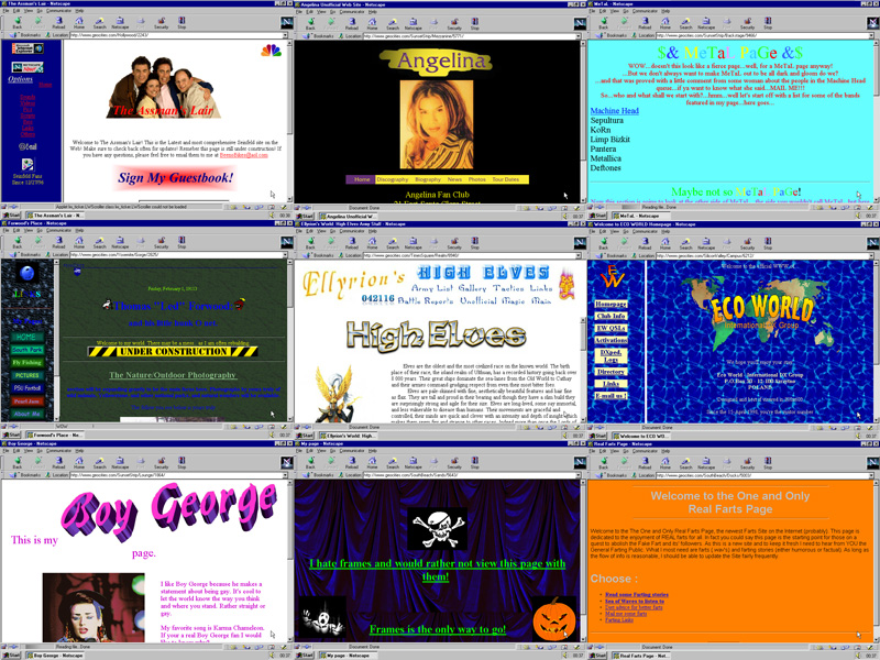
Seeing screenshots of the first websites, especially from the nineties and early 2000s, is like opening a box of surprises: odd layouts, exotic decisions, impossible typefaces, daring navigations. There was everything—for better and worse. That diversity came from two places:
- The learning curve: many people designed “as best they could,” with only a partial grasp of the technology.
- The print legacy: a lot of early web designers came from publishing, carrying over a culture of styles, grids, and composition they tried to translate to the screen.
Then came the MySpace and Hi5 era. Ordinary users—not just developers—could edit their pages, inject personality, and break a thousand conventions in the process. It was a golden age of heterogeneity: catalogs of personal expression, as chaotic as they were authentic.
The shift toward the standard
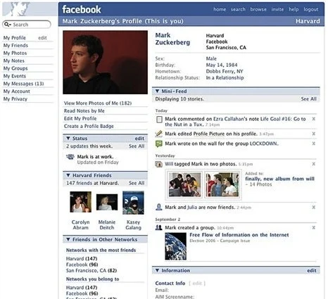
Starting around 2010—without a precise date, but with clear trends—the landscape began to change. Facebook consolidated its dominance, Twitter defined its format, and Instagram added visual storytelling. These platforms weren’t designed for us to customize their look; they were built to highlight content. If you’re going to host millions of posts, a neutral, minimalist, predictable canvas works best.
At the same time, web design and development solidified as an industry with standards and best practices. This was positive: more accessibility, security, validations, consistent flows. But it also had a side effect: homogenization. Business logic—“do more, faster, with less risk”—favored repeatable solutions. WordPress templates, ready-to-use themes, and then frameworks with prebuilt components. The result is the internet of 2025: sites that look, feel, and function remarkably alike.
It’s not “bad design.” On the contrary: it’s proven, efficient, maintainable. The problem is that, en masse, it erases nuance and compresses individuality.
The tension that shaped me
I started designing and developing for the web around 2007–2008. I was always drawn to the idea that every project should have a unique identity. That impulse brought successes and missteps. Some designs aged gracefully; others were, let’s say… peculiar. But in all of them, I tried to leave a piece of soul. I still believe that this “soul” is what makes well-made things memorable.
Enter AI: accelerator… and homogenizer
Artificial intelligence brings a new twist. By its predictive nature, it tends to offer us what’s most likely, most common. If we use it as an “autocomplete” for digital products, we’ll get correct, functional, and… indistinguishable interfaces.
But AI can also be a catalyst. Today we can spend more time on art direction, interaction, and experience, and less on typing line by line. If we guide it with intention—with design judgment, interaction principles, brand sensitivity—it can materialize a vision quickly. If we leave it on its own, it will replicate the average.
That’s the trap: asking it for “what works” and settling for the first result. The hard, valuable part is demanding forms that don’t show up in the first layer of the probable. And you can only demand that if you have something clear to say.
The bar has been raised
Software development is more democratized than ever. Someone who used to be “bad” can become “decent” with good tools. Someone who was “good” now has to be excellent. And excellence isn’t measured only by “does it work,” but also by:
- Expressing a clear intention.
- Differentiating with purpose.
- Having personality without sacrificing accessibility or performance.
- Surprising with judgment, not gimmicks.
It’s not about breaking rules for sport, but using them as a foundation to design with your own voice.
How to recover the soul without losing rigor
- Define intention first: what emotion, tempo, and tone should your experience carry? Name those attributes, then ask AI for them with precision.
- Use the standard as a foundation, not a ceiling: adopt proven components, but adjust composition, rhythm, microinteractions, and visual language to tell your story.
- Design in layers: structure and flow first; then hierarchy and rhythm; then visual character; finally, microdetails that make the difference.
- Iterate with demanding prompts: ask for five contrasting variants, not one; combine the best of each; explicitly ban clichés when needed.
- Measure without killing intention: test usability and accessibility, but don’t let KPIs turn your product into just another template.
- Document your reasoning: create a mini design manifesto for each project. AI executes better when it understands the why, not just the what.
The challenge ahead
The real differentiator won’t be knowing “how to use AI,” but directing it with judgment to create work with intention, character, and coherence. Putting soul back where the market pushes toward the standard. Building software that works, yes—but that also says something. That leaves a mark.
That’s the challenge. And also the opportunity.